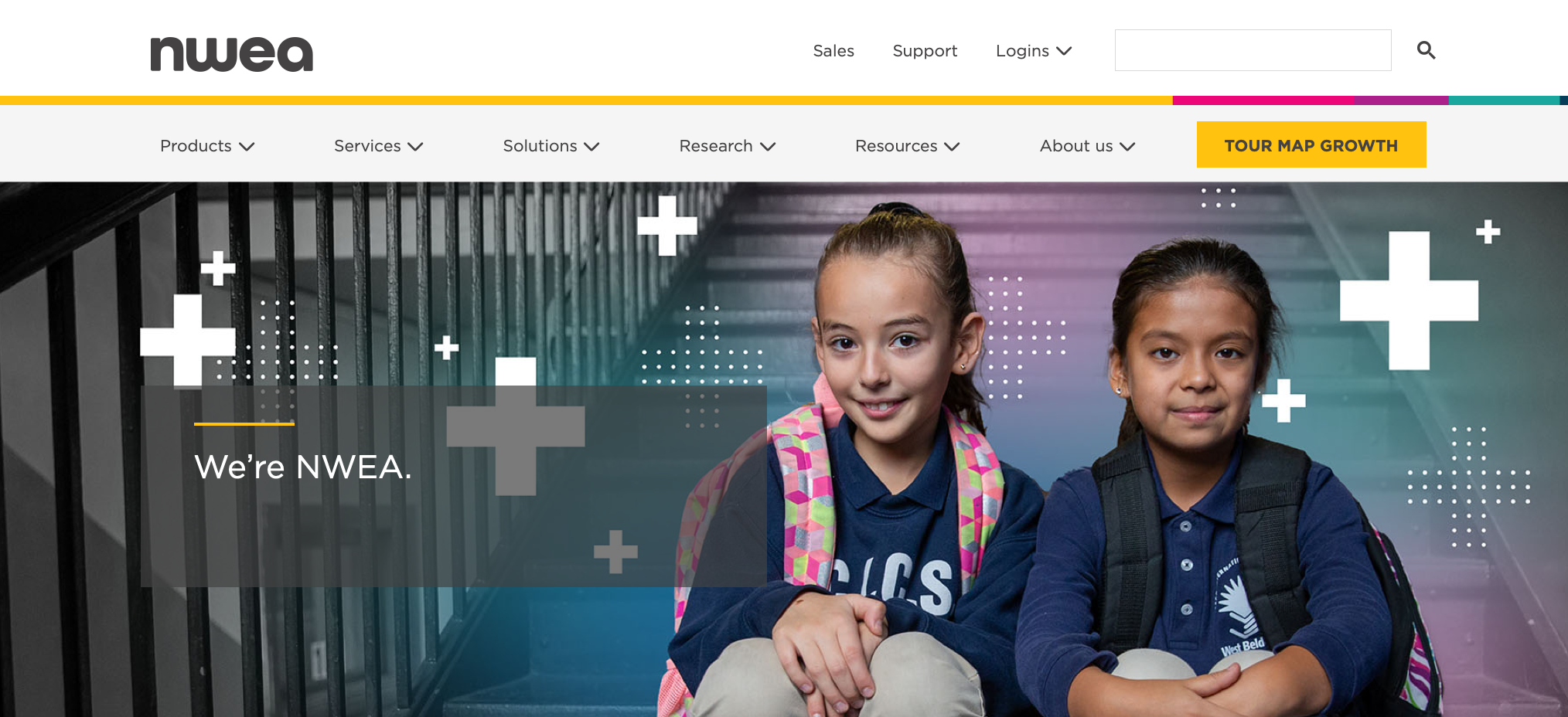
NWEA Brand Evolution
Objective: Raise the profile of NWEA beyond the widely-known MAP assessment. Integrate new products and services into the core NWEA brand while preserving the tone of a newly completed rebrand.
Context: A major rebranding effort was launched in 2017 and positioned MAP Assessments and Research as NWEA’s core strengths. Shortly after the brand launch the business began to expand its offerings through acquisitions and development, culminating in an opportunity to reflect these new or revised products and services as extensions of their mission.
Approach: Evolve the NWEA brand identity and design language to represent the expanding mission of the organization. Establish clear talking points, update the brand story, and create a new design language to bring familiarity and consistency across the brand experience.
Same mission - New methods
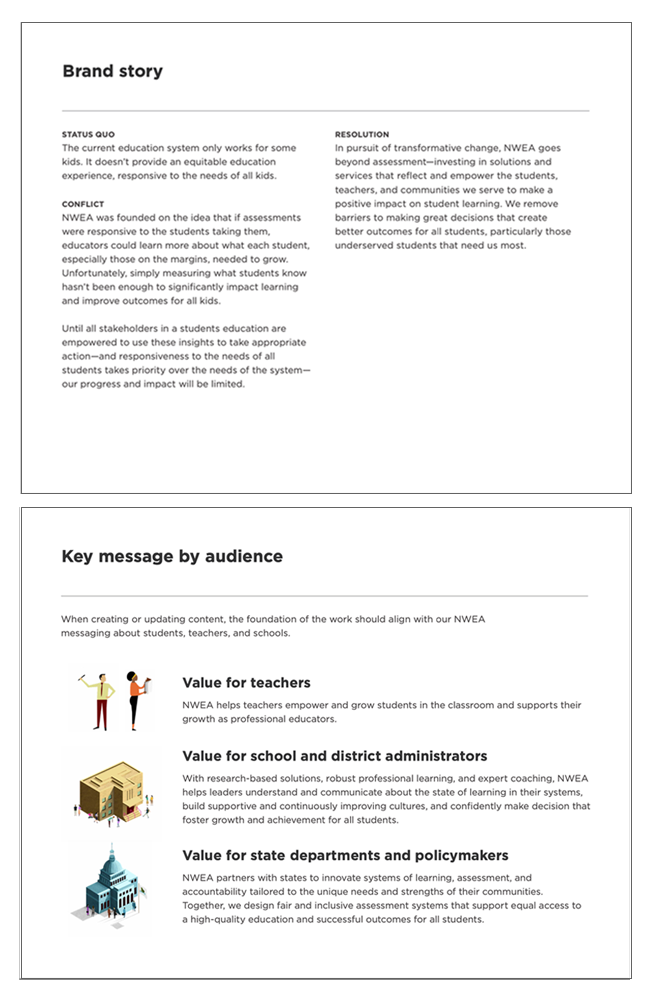
Story: NWEA was expanding its services to include state accountability systems, school improvement services, and partnering with more 3rd party curriculum companies to leverage MAP data in the classroom.
The organization set out to redesign state assessment and bring student equity into a system that historically left marginalized students underserved. It was important that this central idea of “equity beyond assessment” be front and center for the brand.
Audience: The expanded portfolio meant that the NWEA audience was growing. While the student is always at the center of this brand, we create three distinct categories for connecting with our message- teachers, school & district leaders, and state department policymakers. These categories were essential for targeting the right audience with the right message.
Collaborators: Derrick Vargason, copywriter
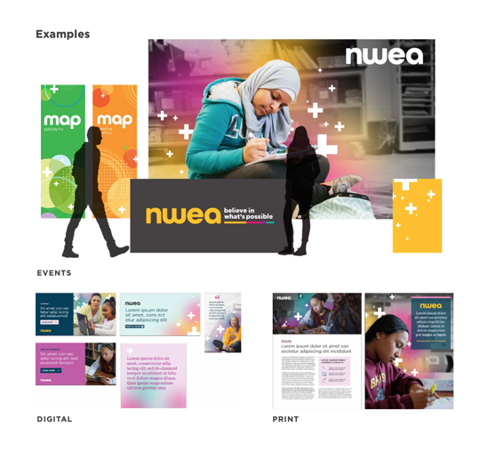
A flexible design language
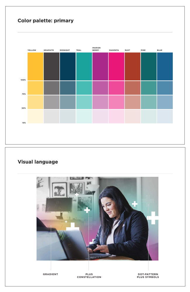
Color: Extending the palette beyond the yellow and graphite gave designers much more flexibility for representing the diverse offerings of the organization.
Visual language: NWEA’s role is to support educators as they help students learn. We set out to reflect this idea in the new visual language. The subject remains the primary focus of the image and the design elements represent the powerful information that can only be delivered by NWEA. Authenticity is important to the brand and we wanted to show subjects in their natural environment. These photos were captured on site with real students and teachers and we wanted to honor that while creating a unique treatment to represent the relationship between the NWEA and the subject.
Collaborators: Yosh White, art direction - Amy Meyer, design
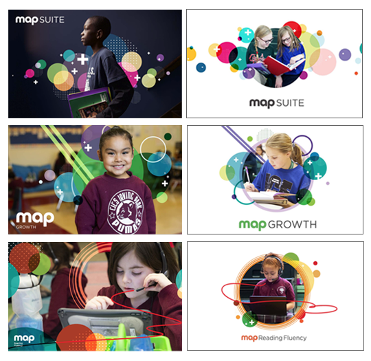
(MAP) Growth in motion
Visual language: The MAP Growth assessment is the heart of the NWEA’s brand and we challenged ourselves to convey the power of this assessment in a visual format. Every student is unique and the assessment provides specific information about how that student is growing academically. This design system is meant to humanize data in a bold and engaging way. MAP assessments visualize information to inform learning opportunities. Our goal was to bring student assessment data into the real world and present knowledge as a unique aura of academic growth.
Collaborators: Yosh White, art direction - Amy Meyer, design
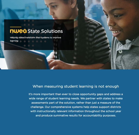
A new take on state assessment
Brand Positioning: Driven by its mission, NWEA set out to improve state assessment systems to support student growth, instead of just measuring proficiency. Our goal was to leverage the brands excellent reputation for assessment and apply this brand equity to their new line of state assessment products and services. We created the NWEA State Solutions brand to speak directly to the state leader audience, addressing their issues and leveraging our expertise to deliver a new accountability system.
Visual language: Our challenge was clear, tie this new line of business to the core NWEA brand, create a unique identity in the marketplace, and distinguish it from the district level offerings. The team created a sub-brand that used a similar visual treatment as the core brand with a limited set of brand colors to represent NWEA State Solutions.
Collaborators: Yosh White, art direction - Amy Meyer, design - Erin Ryan, copy
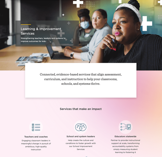
Learning never ends
Brand Positioning: NWEA acquired several professional learning organizations to expand its offerings in this space. These new additions required us to think differently about these services- they were no longer just for teachers. We developed a Learning and Improvement Services division to bring together teacher development, school and district improvement services, and state level instructional support. This sub-brand gave NWEA the ability to decouple professional learning from assessment and address each of these audiences with specific message under one voice.
Visual language: We set out to establish this extension of services as a core competency of the NWEA brand. The team leveraged the visual treatment of the core brand using educator images to clarify who this line of business is meant to serve.
Collaborators: Yosh White, art direction - Amy Meyer, design - Erin Ryan, copy
Leading with NWEA
Brand Positioning: While primarily known for delivering MAP assessments, NWEA had much more to offer educators and leaders across the education eco-system. We wanted to bring more awareness to the NWEA brand, beyond MAP. This brand evolution helped position NWEA as a multi-service organization with new avenues to bring its mission to life. This flexible design system and strong visual language provides room for future growth while setting it apart from its competitors. The system also allowed for NWEA to speak to the needs of its diverse audience with a familiar voice and consistent visual language.
Collaborators: Yosh White, art direction - Amy Meyer, design - Erin Ryan, copy