Heinemann Brand Refresh
Objective: Transition Heinemann's brand perception from a "literacy" forward brand to one that offers supplemental solutions for multiple subjects.
Context: Heinemann established its brand perception based on educator success with several popular literacy products. Over time, the company diversified its product offerings to include math resources as well as expanded its literacy portfolio to provide flexible options for educators and administrators. While the organization evolved, the brand identity hadn't changed and was no longer reflecting the direction of the company.
Approach: Given the stagnant tenure of the brand and heavy investment in new products, I opted for a major brand refresh. Heinemann wasn't actively updating the brand and with the public controversy around the literacy products, we knew that we needed to show how this company was evolving to meet the needs of students and educators.
A new chapter
Brand Status: Heinemann was experiencing a dramatic drop in sales and brand equity. The company had undergone tremendous change and was struggling to evolve its brand perception.
Clarifying Strategy: The brand was outdated and no longer able to represent the company Heinemann was becoming. It was time for a major rebrand. We lead discovery meetings with leadership and key contributors across the organization. We gathered a clear picture of where the business was headed and created a plan for developing a brand identity to support this vision.
Contributors: Onalee Smith, copy and messaging
A future-forward brand
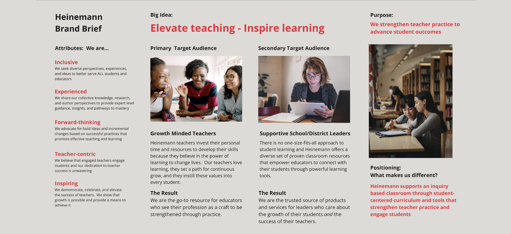
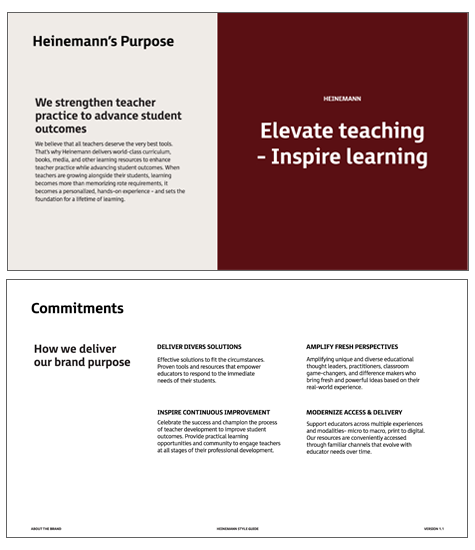
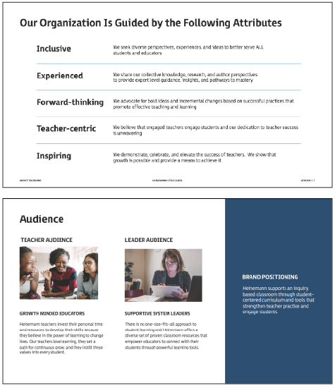
Definition: I worked hand-in-hand with company leadership to redefine the company narrative, clarify our purpose, establish new company commitments, and identify the attributes that define the culture. We also developed audience categories for teachers school/district leaders. The brand brief (1st image above) was a powerful tool to build stakeholder alignment and bring visibility throughout the definition process. This source of truth helped keep us moving forward with a shared vision for the story behind this brand.
Brand Story: The end result was a new brand story- one that honors its historical strengths while positioning it as a modern, future-oriented brand serving tomorrow’s educators and administrators.
Adoption: I launched the new brand internally and it was well received. To support the rollout, we created talking points, brand guidelines, asset libraries and other tools. My team spent weeks meeting with individual teams and holding open office hours to help folks adopt this new brand.
Contributors: Onalee Smith, copy and messaging
A flexible design language
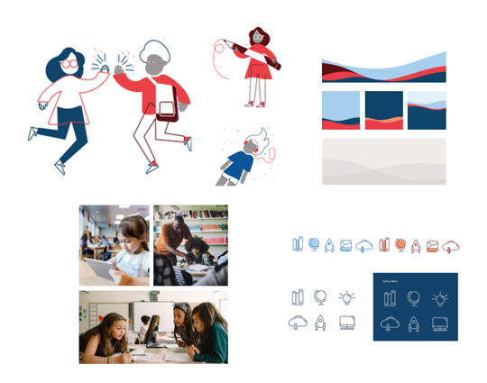
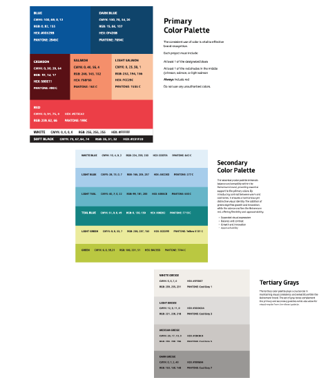
Visual Identity: Through our competitor research we identified a color palette to differentiate our brand amongst our competitors. I decided to keep several of the core colors for continuity but the team tweaked the values and shifted their role in our design system. The creative team also created a secondary color palette and a set of tertiary grays to provide more flexibility for the growing brand. The team also embraced a unique illustration style and created other dynamic design elements to bring this brand to life.
Contributors: Yosh White, art direction

A fun and fresh identity
Brand identity: The creative team did an excellent job of delivering a visual identity that reflects and elevates the story I wanted to tell about this updated brand. The end result is a fresh and modern take on a familiar brand. Through this process we were able to differentiate this brand from other supplemental curriculum companies. Especially those that are focused on literacy products.
Brand perception: This rebrand gave Heinemann an opportunity to define how they want to show up in the market. So much of Heinemann’s historical brand was defined for them. With this in mind, the new brand commitments give them an opportunity to associate the Heinemann name with topics that resonate across the education ecosystem.
Contributors: Yosh White, art direction - Courtney Enos, illustration and design - Kelly Goodwin, design - Onalee Smith, copy and content.