Product Branding
Objective: Define and build product identities that live within a parent brand while standing clearly on their own in a competitive market.
Context: Product branding inside a large EdTech organization is a different challenge than building a brand from scratch. The product has to honor the parent brand's equity, differentiate itself within an often crowded product portfolio, and speak directly to the educator or administrator making the purchase decision. A logo that doesn't carry strategic intent fails all three.
Approach: Each engagement began with a clear brief, internal stakeholder alignment, and a thorough understanding of where the product sits within the competitive landscape. From there, naming, visual identity, and design language were developed to give each product a distinct presence while reinforcing the strength of the brand it belongs to.
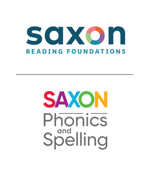
Saxon Reading Foundations
Branding: The Saxon product underwent a major upgrade with new functionality and features. The original logo didn’t pass our accessibility standards so our team designed the logo (above) and established the color palette for use in the product. The team focused on making the logo easier to read (for all visibility levels) and turned the “o” into a design element that can be used as a standalone brand asset.
Naming: The product team added new functionality that goes beyond phonics and spelling. This change provided an opportunity to find a name that more accurately described the product and created a unique name in the literacy space.
Process: We led an internal stakeholder alignment process, built a creative brief, generated potential names, conducted external surveys, legal reviews and trademark vetting, and offered final naming recommendations.
Collaborators: Yosh White, art direction
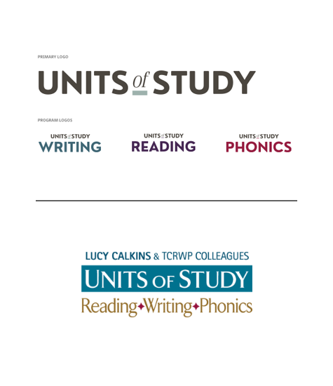
Units of Study
Branding: The goal for rebranding this product was to simplify and modernize the logo. The original logo (below) was trying to do too much and inturn, wasn’t helping to distinguish between the suite of product and the individual units for writing, reading, and phonics. We gave each unit its own color way and this was adopted into the product line.
Process: We led an internal stakeholder alignment process, creative brief, and design exploration. The team narrowed down the best few options for client feedback. From here we partnered with the client to make final adjustments to the finished logo you see here.
Collaborators: Yosh White, art direction
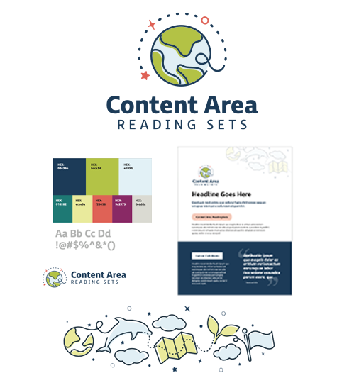
Content Area Reading Sets
Branding: The goal for rebranding this product was to add a sense of fun and whimsy to this collection of books and materials. Reading is fun and the previous branding wasn’t reflecting the materials.
Process: The color palette is meant to associate this product to the Heinemann brand while providing a unique look in the market. The illustrations are meant to convey the connection between reading practice through subject matter learning opportunities, like science.
Collaborators: Kelly Goodwin, designer - Yosh White, art direction